Sammy’s Delicatessen
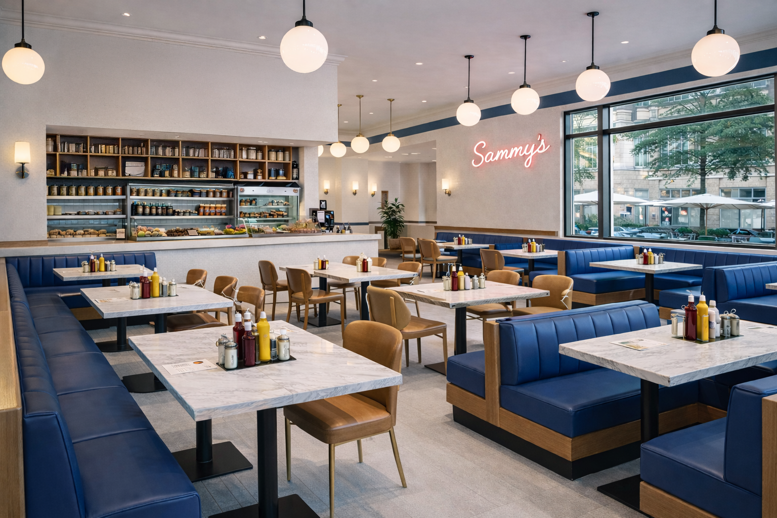
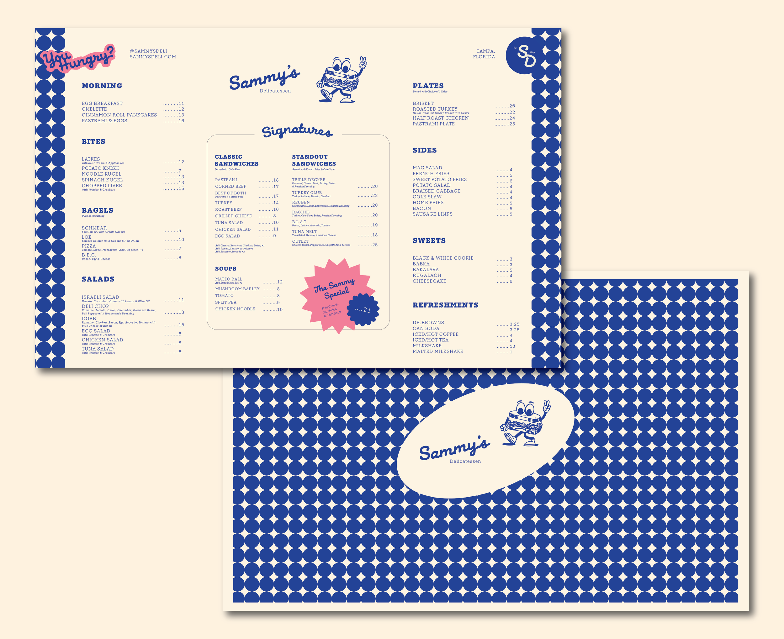
A modern take on a classic Jewish deli. This concept retains the comfort and familiarity of an old-school deli while elevating it to a more intentional and design-forward experience. A significant focus was placed on the menu design. Given that deli menus can be dense, the challenge was to create clarity without losing character.
The layout emphasizes strong hierarchy, consistent spacing, and a simple structure, ensuring everything is easy to navigate at a glance while still feeling full and authentic. Typography plays a crucial role in this design. Bold, straightforward headers paired with a more expressive script create contrast and inject personality without overwhelming the overall aesthetic. This approach allows the brand to transition seamlessly between classic and playful tones.
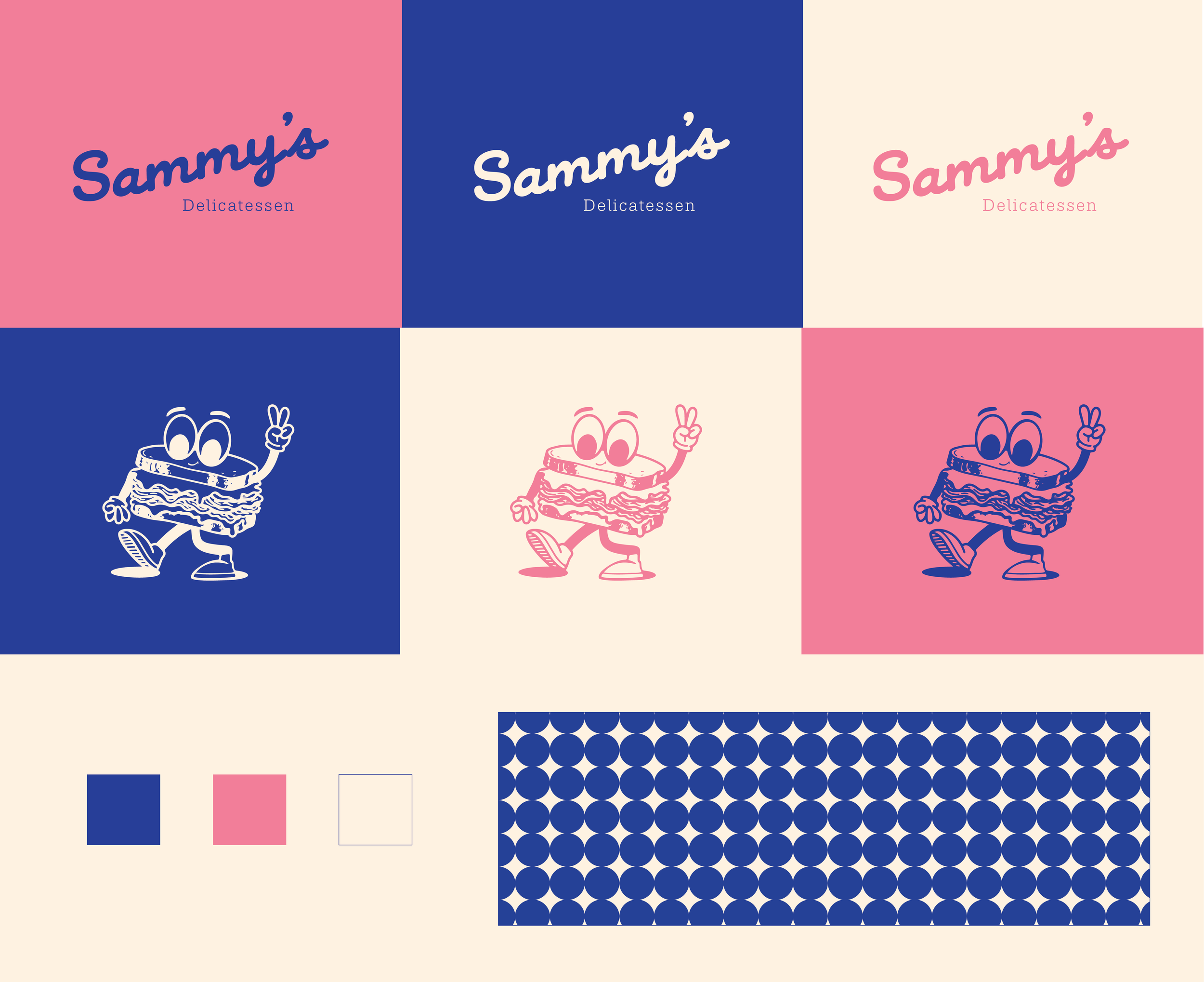
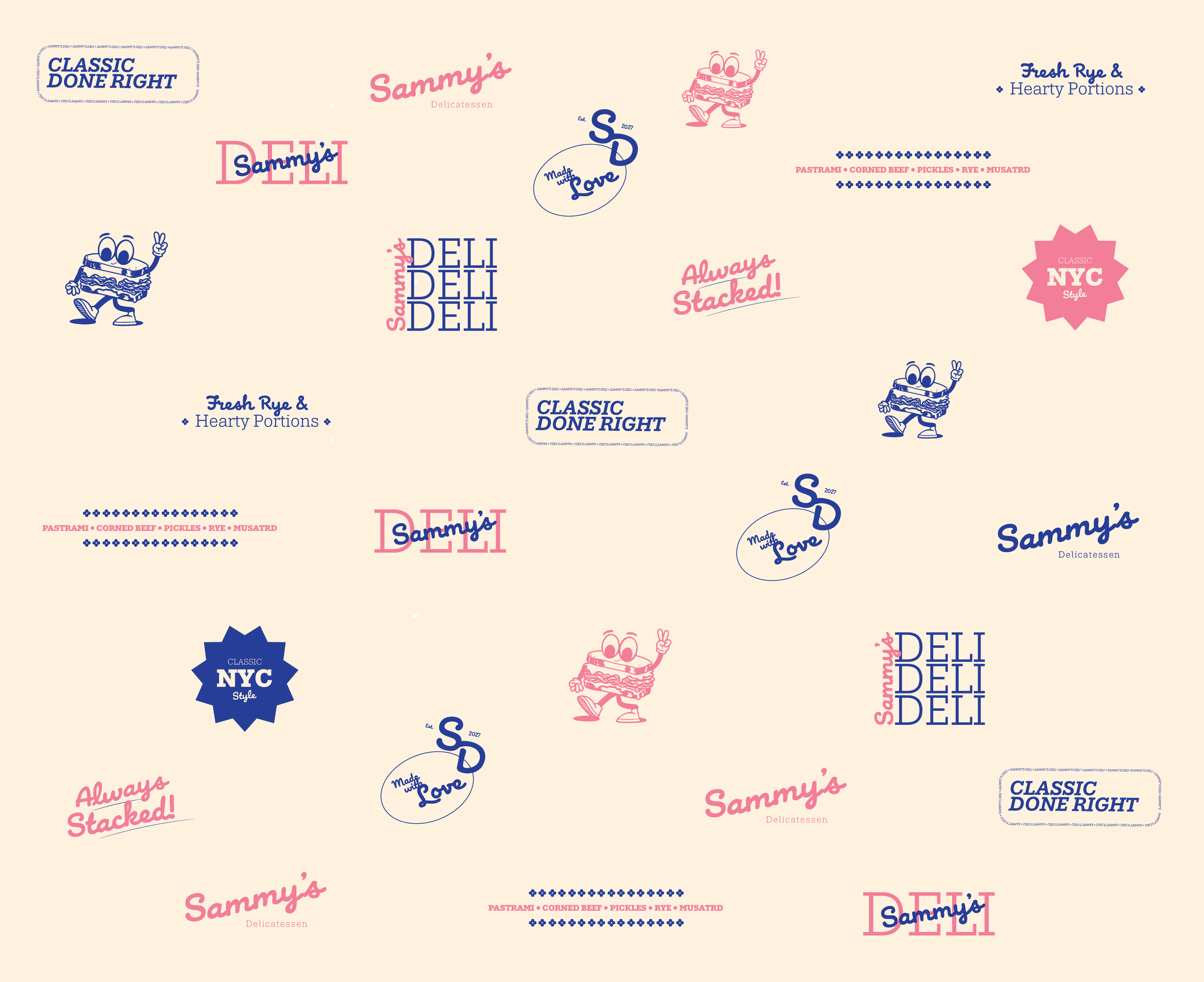
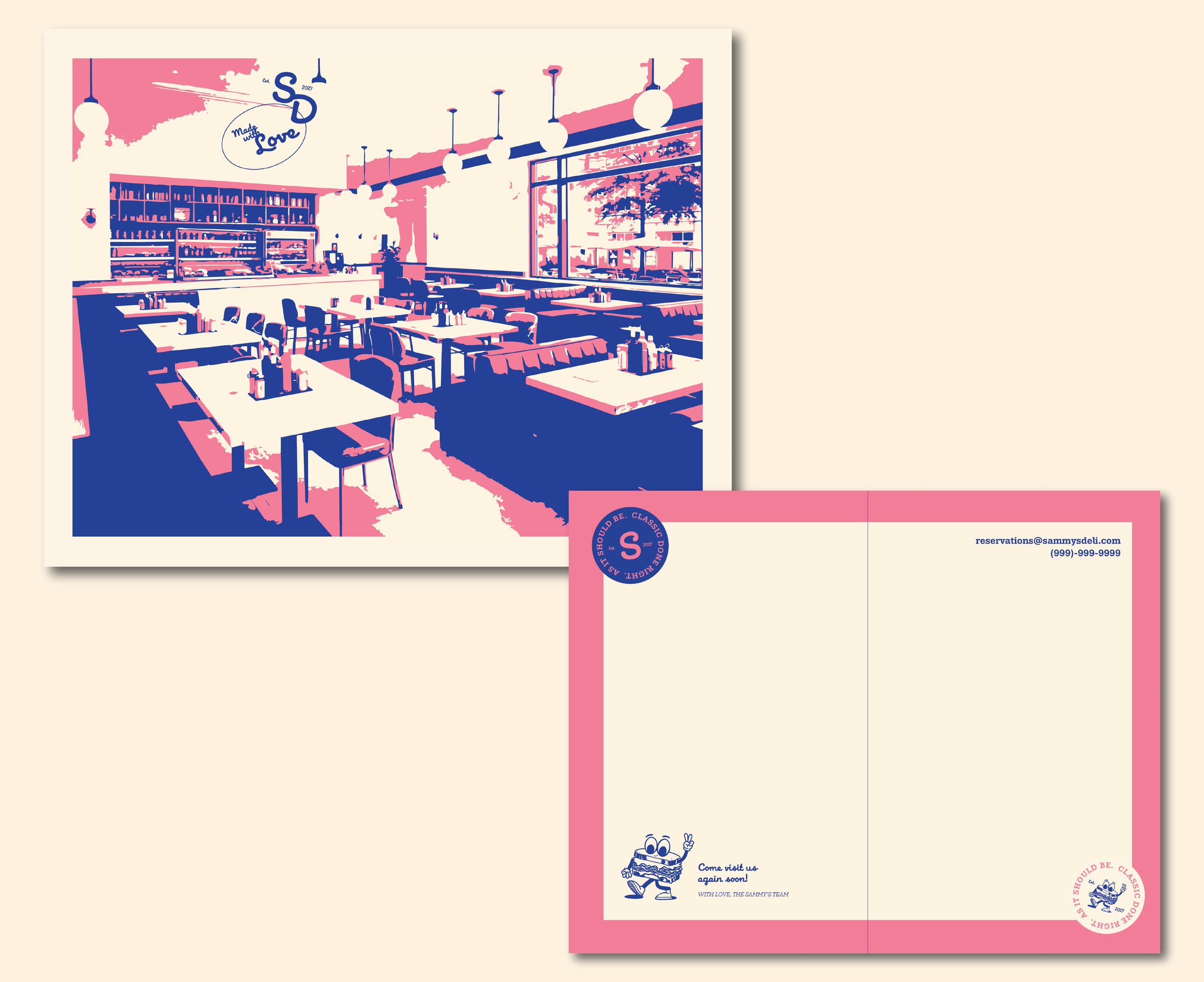
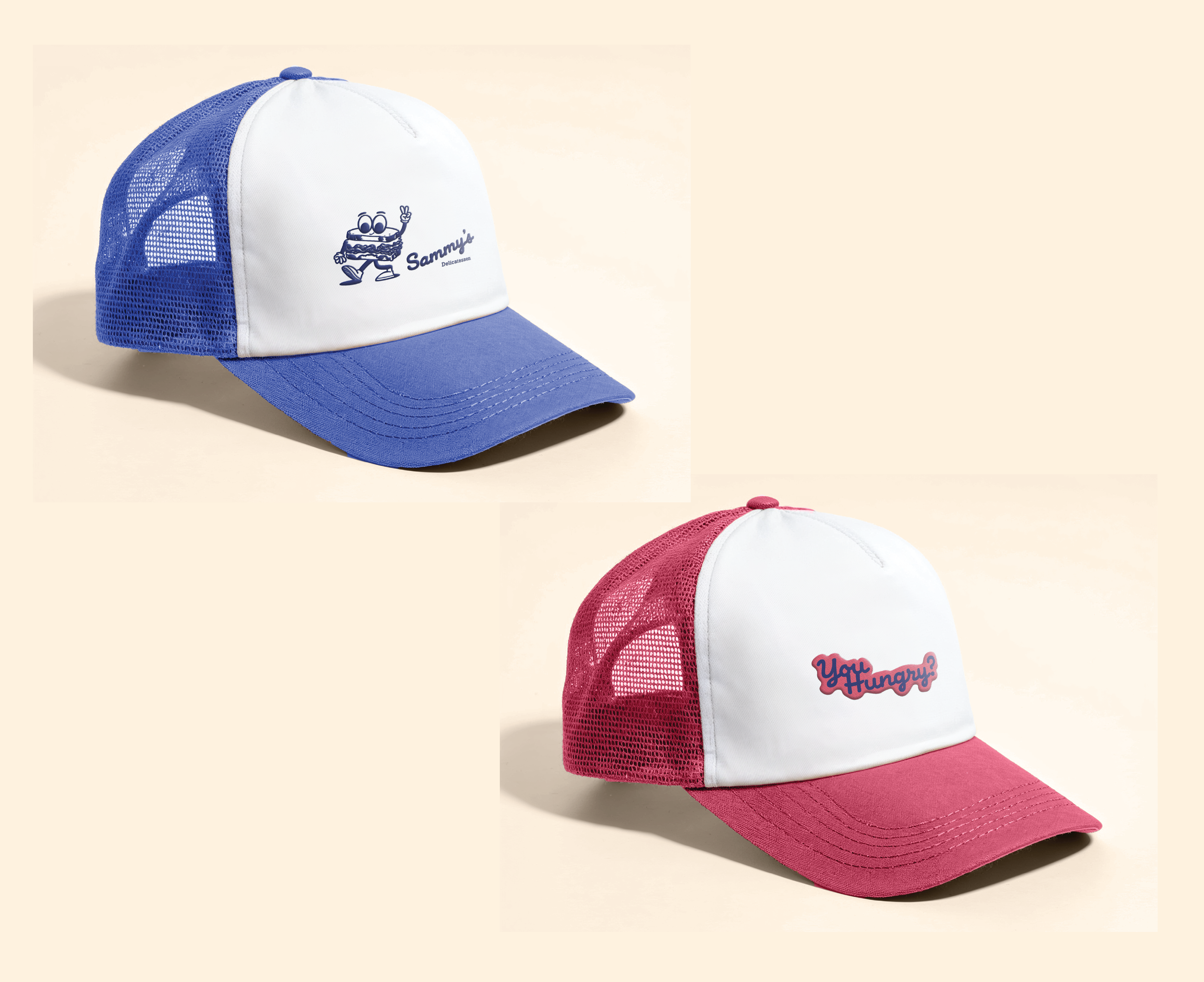
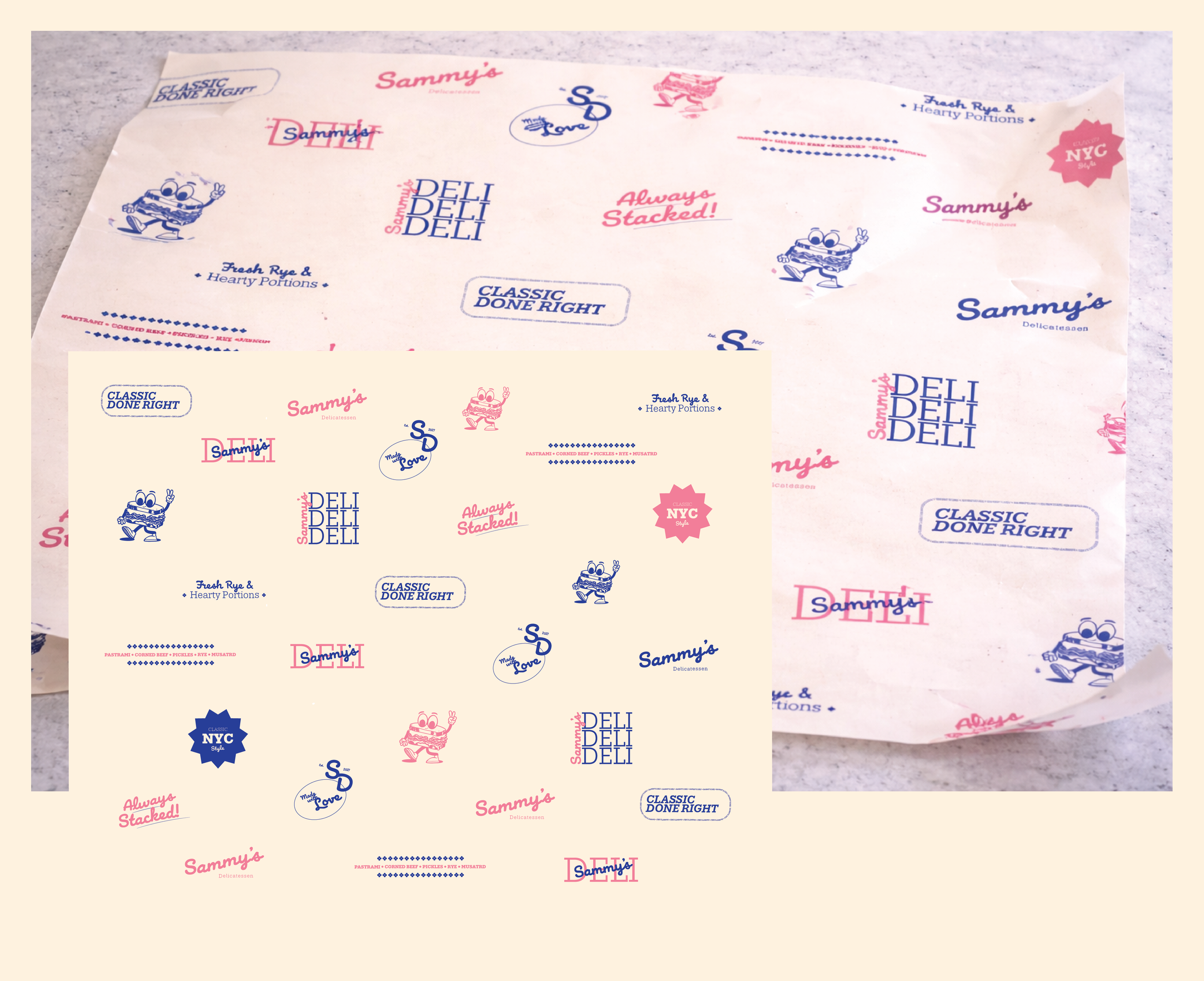
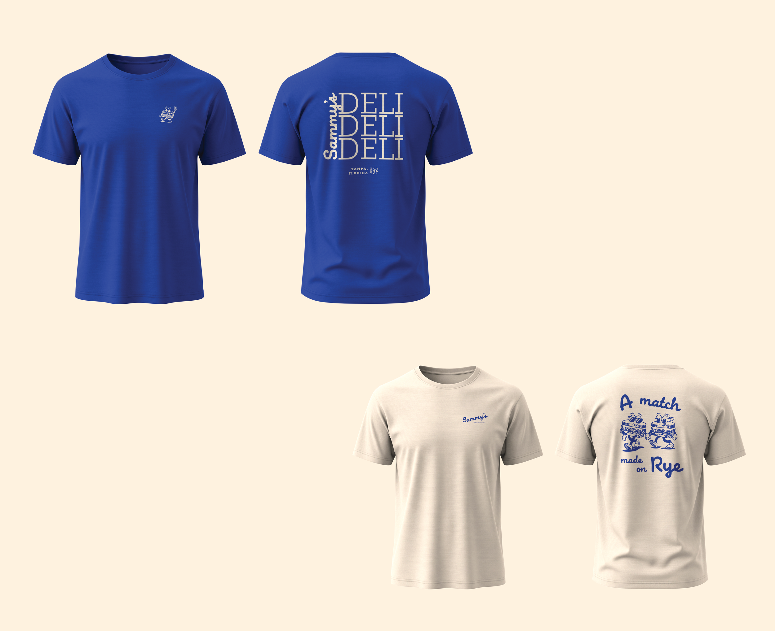
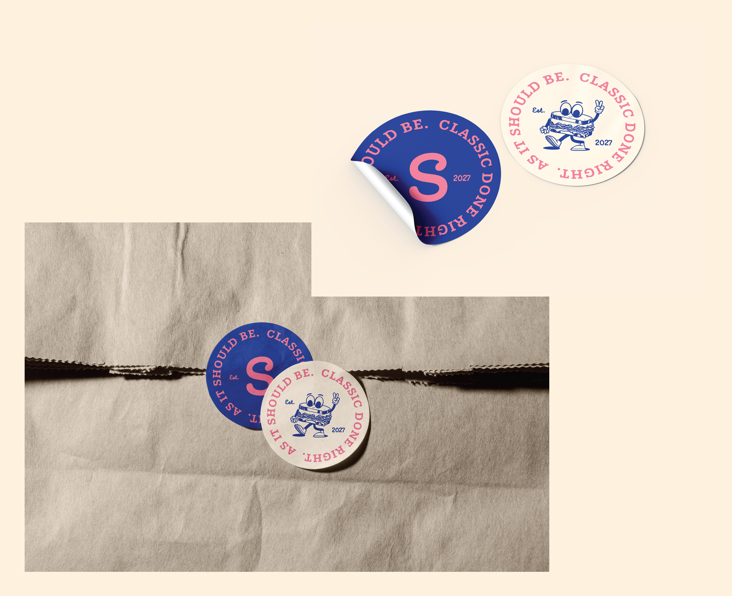
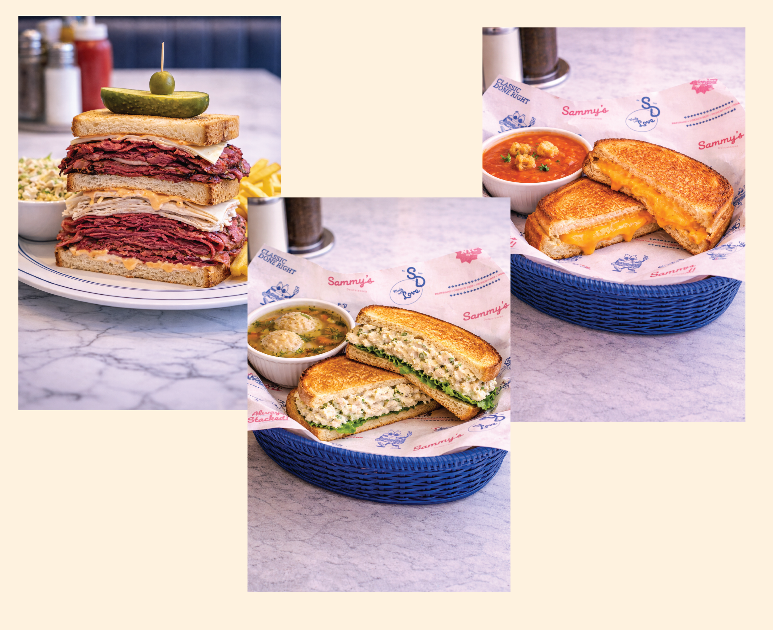
The color palette is simple yet engaging. Navy provides a grounded, timeless feel, complemented by a soft pink that adds warmth and energy. This palette is consistent across menus, merchandise, and packaging. Additionally, fun details enhance the brand's voice with short, confident phrases like “You Hungry?”, “Classic Done Right,” and “As It Should Be.” A key branding image features a cartoon Reuben sandwich, designed to be a standout element that is recognizable and consistent across all mediums.